
Designing Banking Infrastructure
from Scratch
from Scratch
Designing Banking Infrastructure
from Scratch
from Scratch
Designed the full banking ecosystem from scratch: KYC-compliant onboarding, card issuing, SWIFT transfers, and operational tools for a regulated financial product — all as the solo designer.
Designed the full banking ecosystem from scratch: KYC-compliant onboarding, card issuing, SWIFT transfers, and operational tools for a regulated financial product — all as the solo designer.
INDUSTRY:
INDUSTRY:
FINTECH
FINTECH
YEAR:
YEAR:
2023
2023
EXPERIENCE:
EXPERIENCE:
PRODUCT DESIGN
PRODUCT DESIGN
01. Context
Sber is Russia's largest bank with 100M+ active retail clients. Even minor user experience issues result in millions of support requests annually.
Sber has built a digital ecosystem where the Salyut voice assistant connects smart devices (TVs, speakers, tablets), smart home, and banking services. In the SberBank Online mobile app, users can manage their finances by voice — check balances, make transfers, and pay bills.
My role – Product Designer in the Customer Wallet tribe. I designed self-service banking features that reduce support load and give users more autonomy and clarity.
02. The challenge
02. The challenge
Card blocking is one of the most frequent and critical operations. Lost card, stuck in an ATM, suspicious transaction: situations that require immediate action, often in inconvenient conditions like while driving, on public transport, or at work.
Analysis of support requests and call transcripts showed the problem: calling the contact center takes around 5 minutes with waiting, identification, and a voice robot that misunderstands and keeps asking again. People end up shouting into the phone in panic. The app is faster, but requires finding the right section and going through multiple screens, not ideal in a stressful situation.
The Salyut voice assistant in the app could solve the problem: user is already authenticated, one command and the card is blocked in 10 seconds. The challenge was to design this critical scenario to work quickly, clearly, and without errors when dealing with users' money.
Based on the research, I defined both problem and solution hypotheses. I assumed that users struggled to manage tariffs because there was no single interface and they depended on the backend team. Giving users the ability to add and manage data about clients, contracts, and tariff grids in one place — with a clear hierarchy and access restrictions – would reduce mistakes and make them fully autonomous.
Based on the research, I defined both problem and solution hypotheses. I assumed that users struggled to manage tariffs because there was no single interface and they depended on the backend team. Giving users the ability to add and manage data about clients, contracts, and tariff grids in one place — with a clear hierarchy and access restrictions – would reduce mistakes and make them fully autonomous.
03. Discovery
To understand how users interact with voice assistants in critical situations, I conducted discovery research including interviews and usability testing. This revealed key barriers: deep distrust of voice technology from past frustrating experiences, and fundamental misunderstandings about what "blocking" means.
Based on the research, I defined both problem and solution hypotheses. I assumed that users struggled to manage tariffs because there was no single interface and they depended on the backend team. Giving users the ability to add and manage data about clients, contracts, and tariff grids in one place — with a clear hierarchy and access restrictions – would reduce mistakes and make them fully autonomous.
Based on the research, I defined both problem and solution hypotheses. I assumed that users struggled to manage tariffs because there was no single interface and they depended on the backend team. Giving users the ability to add and manage data about clients, contracts, and tariff grids in one place — with a clear hierarchy and access restrictions – would reduce mistakes and make them fully autonomous.
When I called (SberNumber), sometimes the assistants are too scripted, and they might not understand something, which is inconvenient.
"I prefer doing things manually. My daughter uses voice control, but I don't." Voice assistants perceived as toys, not serious tools.
Two respondents used voice control only in navigation (Yandex Maps): "I see voice control as a gimmick."
Another viewed Siri as a toy: "It misunderstands, and I have to redo things. The technology is still at a low level."
04. User Pain Points
Freelancers, students, and young professionals across Europe shared the same frustrations with traditional banks. Four problems emerged consistently.
Based on the research, I defined both problem and solution hypotheses. I assumed that users struggled to manage tariffs because there was no single interface and they depended on the backend team. Giving users the ability to add and manage data about clients, contracts, and tariff grids in one place — with a clear hierarchy and access restrictions – would reduce mistakes and make them fully autonomous.
Based on the research, I defined both problem and solution hypotheses. I assumed that users struggled to manage tariffs because there was no single interface and they depended on the backend team. Giving users the ability to add and manage data about clients, contracts, and tariff grids in one place — with a clear hierarchy and access restrictions – would reduce mistakes and make them fully autonomous.
[ 01 ]
Slow Account Opening
Branch visits, paper documents, and weeks of waiting made opening accounts impossible for mobile users.
[ 01 ]
Slow Account Opening
Branch visits, paper documents, and weeks of waiting made opening accounts impossible for mobile users.
[ 01 ]
Slow Account Opening
Branch visits, paper documents, and weeks of waiting made opening accounts impossible for mobile users.
[ 02 ]
Expensive & Hidden Fees
High fees and unclear exchange rates made international transfers unpredictable and costly.
[ 02 ]
Expensive & Hidden Fees
High fees and unclear exchange rates made international transfers unpredictable and costly.
[ 02 ]
Expensive & Hidden Fees
High fees and unclear exchange rates made international transfers unpredictable and costly.
[ 03 ]
Zero Spending Control
No real-time notifications, no instant card controls, no spending limits. Users had zero control over their money.
[ 03 ]
Zero Spending Control
No real-time notifications, no instant card controls, no spending limits. Users had zero control over their money.
[ 03 ]
Zero Spending Control
No real-time notifications, no instant card controls, no spending limits. Users had zero control over their money.
05. Competitive Analysis
I analyzed leading digital banks to understand what users expected from modern banking experiences and identify opportunities for differentiation.

Multi-currency accounts, cryptocurrency trading, stock investments, insurance products, business accounts, and travel perks.

International money transfers at mid-market rates, multi-currency account with 40+ currencies, debit card.

Free IBAN account with Mastercard, real-time spending notifications, instant transfers within SEPA zone, budget management tools.
06. Problem Statement
⚡️
Users managing money internationally needed transparent pricing, instant account opening, and complete banking functionality in one place — but were forced into fragmented workflows across multiple platforms, unclear fee structures, and weeks-long onboarding processes that made digital banking feel as bureaucratic as traditional banks.
07. Defining the MVP
Based on research insights, I mapped critical user journeys and defined the MVP scope for the mobile app: essential banking functionality without feature bloat. Three flows needed to work flawlessly – account onboarding and KYC verification, money management and transfers, and card issuance with controls.
Based on the research, I defined both problem and solution hypotheses. I assumed that users struggled to manage tariffs because there was no single interface and they depended on the backend team. Giving users the ability to add and manage data about clients, contracts, and tariff grids in one place — with a clear hierarchy and access restrictions – would reduce mistakes and make them fully autonomous.
Based on the research, I defined both problem and solution hypotheses. I assumed that users struggled to manage tariffs because there was no single interface and they depended on the backend team. Giving users the ability to add and manage data about clients, contracts, and tariff grids in one place — with a clear hierarchy and access restrictions – would reduce mistakes and make them fully autonomous.
→
Onboarding & Verification
Onboarding & Verification
→
Account Dashboard
Account Dashboard
→
Card Management
Card Management
→
Payments & Transfers
Payments & Transfers
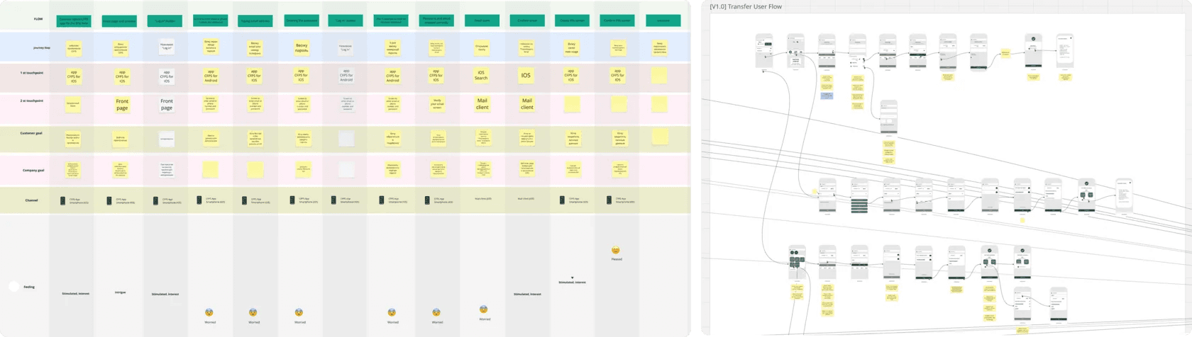
08. User Flows & Wireframes
08. User Flows
& Wireframes
& Wireframes
I mapped detailed user flows for critical features — account registration, KYC verification, card issuance, transfers, and transaction management — identifying decision points, error states, and regulatory requirements at each step.
Low-fidelity wireframes validated these flows with the team, testing navigation patterns and compliance requirements before high-fidelity design. This helped catch regulatory and technical constraints early, reducing costly iterations later.
Based on the research, I defined both problem and solution hypotheses. I assumed that users struggled to manage tariffs because there was no single interface and they depended on the backend team. Giving users the ability to add and manage data about clients, contracts, and tariff grids in one place — with a clear hierarchy and access restrictions – would reduce mistakes and make them fully autonomous.
Based on the research, I defined both problem and solution hypotheses. I assumed that users struggled to manage tariffs because there was no single interface and they depended on the backend team. Giving users the ability to add and manage data about clients, contracts, and tariff grids in one place — with a clear hierarchy and access restrictions – would reduce mistakes and make them fully autonomous.
09. Low-Fidelity Testing & Iteration
09. Low-Fidelity Testing
& Iteration
I tested low-fidelity prototypes with 8 potential users to validate core flows and identify critical usability issues before investing in high-fidelity design. Testing 31 hypotheses across key features revealed 9 critical issues that would have caused significant drop-off in production, while validating 21 hypotheses and identifying 11 areas requiring iteration.
Based on the research, I defined both problem and solution hypotheses. I assumed that users struggled to manage tariffs because there was no single interface and they depended on the backend team. Giving users the ability to add and manage data about clients, contracts, and tariff grids in one place — with a clear hierarchy and access restrictions – would reduce mistakes and make them fully autonomous.
Based on the research, I defined both problem and solution hypotheses. I assumed that users struggled to manage tariffs because there was no single interface and they depended on the backend team. Giving users the ability to add and manage data about clients, contracts, and tariff grids in one place — with a clear hierarchy and access restrictions – would reduce mistakes and make them fully autonomous.
[ 01 ]
Design Issues
6 problems (3 high, 3 medium) – document upload requirements needed clarification, KYC progress wasn't visible, card control layout confused users.
[ 01 ]
Design Issues
6 problems (3 high, 3 medium) – document upload requirements needed clarification, KYC progress wasn't visible, card control layout confused users.
[ 01 ]
Design Issues
6 problems (3 high, 3 medium) – document upload requirements needed clarification, KYC progress wasn't visible, card control layout confused users.
[ 02 ]
Content & Copy
7 problems (3 high, 2 medium, 2 low) – card terms and conditions weren't clear, delivery tracking status caused confusion, fee structure needed better explanation.
[ 02 ]
Content & Copy
7 problems (3 high, 2 medium, 2 low) – card terms and conditions weren't clear, delivery tracking status caused confusion, fee structure needed better explanation.
[ 02 ]
Content & Copy
7 problems (3 high, 2 medium, 2 low) – card terms and conditions weren't clear, delivery tracking status caused confusion, fee structure needed better explanation.
[ 03 ]
Navigation
1 problem (medium) – users couldn't locate key actions during account setup and card management.
[ 03 ]
Navigation
1 problem (medium) – users couldn't locate key actions during account setup and card management.
[ 03 ]
Navigation
1 problem (medium) – users couldn't locate key actions during account setup and card management.
10. Design system
Main scenarios were clear, wireframes were ready and approved, so I started building the first version.
I began with the design system: created base components, color, typography, and grid guides.
Main scenarios were clear, wireframes were ready and approved, so I started building the first version.
I began with the design system: created base components, color, typography, and grid guides.
Main scenarios were clear, wireframes were ready and approved, so I started building the first version.
I began with the design system: created base components, color, typography, and grid guides.

11. Components
I added atoms – buttons, icons, and input fields – then progressed to molecules like forms, navigation menus, notifications, and card layouts that combined these foundational elements into reusable patterns.
I added atoms – buttons, icons, and input fields – then progressed to molecules like forms, navigation menus, notifications, and card layouts that combined these foundational elements into reusable patterns.
I added atoms – buttons, icons, and input fields – then progressed to molecules like forms, navigation menus, notifications, and card layouts that combined these foundational elements into reusable patterns.

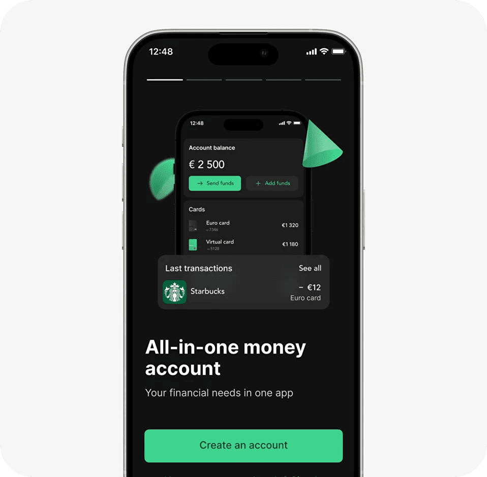
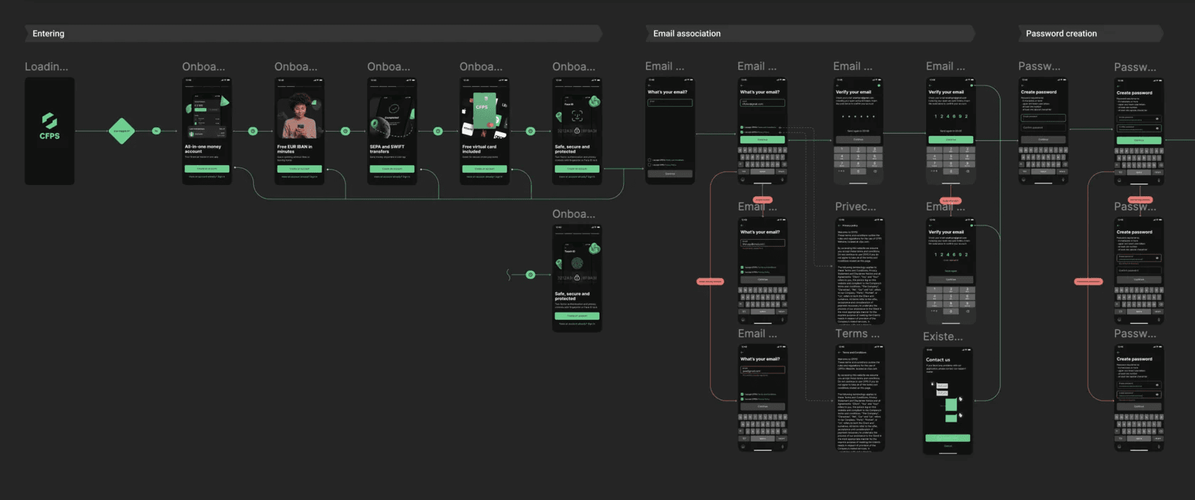
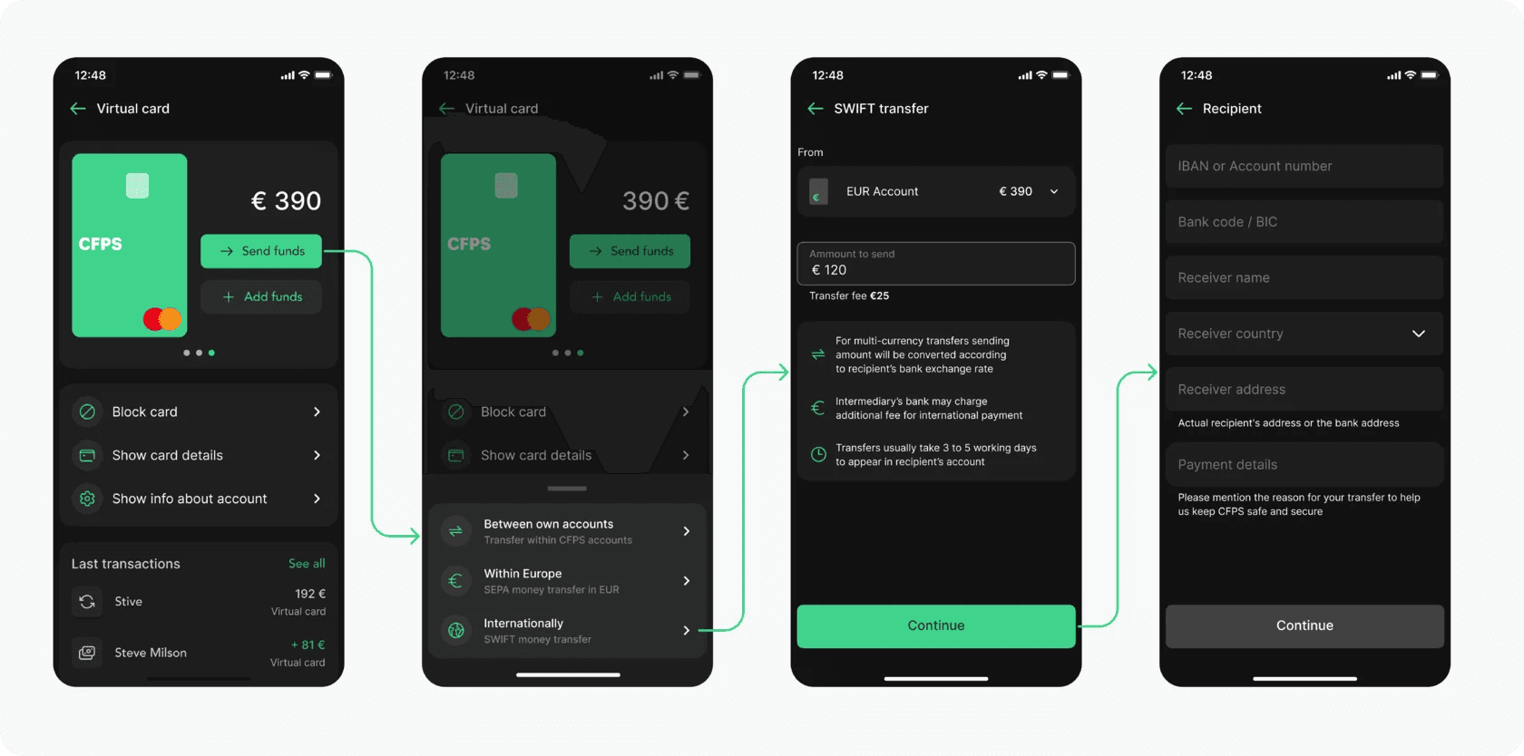
12. High-Fidelity Design
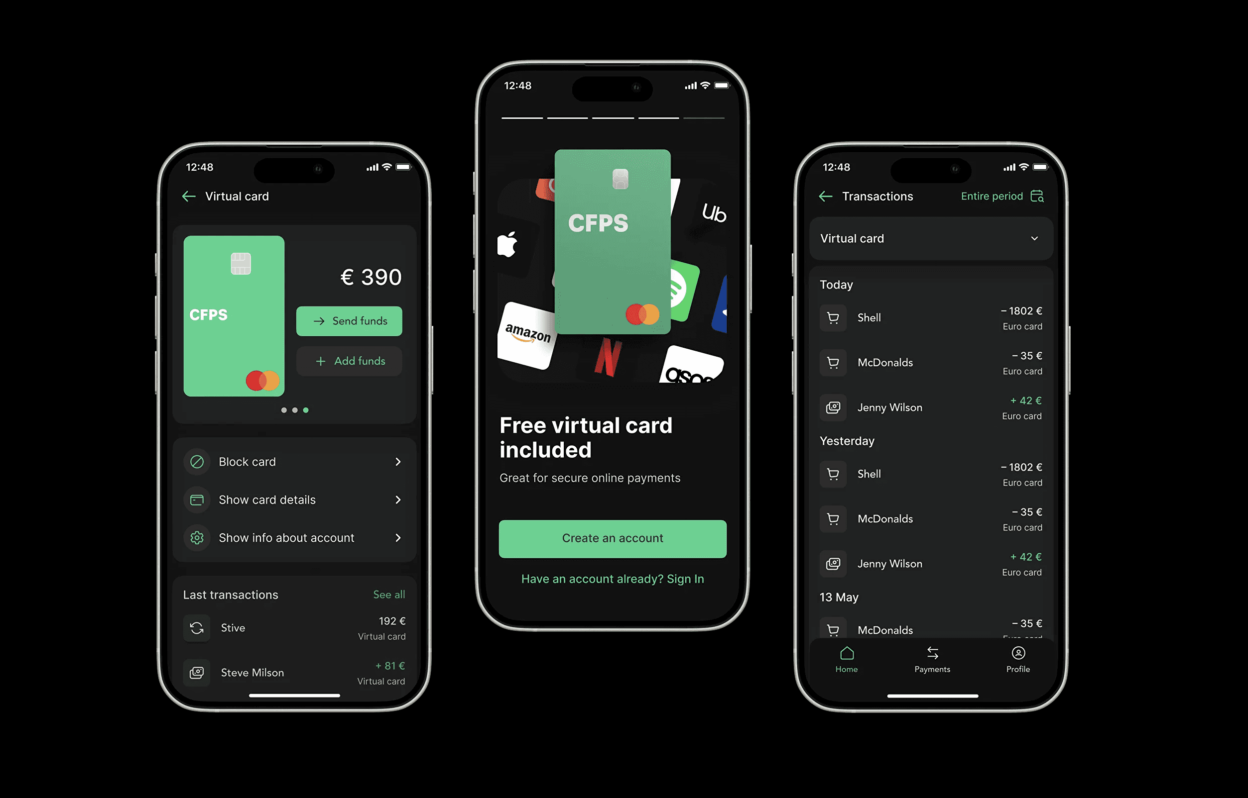
High-fidelity design was built in phases: onboarding and KYC first, then dashboard and card management, followed by transaction history, transfers, and SWIFT payments. Each iteration added critical functionality while maintaining consistency through the design system.
High-fidelity design was built in phases: onboarding and KYC first, then dashboard and card management, followed by transaction history, transfers, and SWIFT payments. Each iteration added critical functionality while maintaining consistency through the design system.
High-fidelity design was built in phases: onboarding and KYC first, then dashboard and card management, followed by transaction history, transfers, and SWIFT payments. Each iteration added critical functionality while maintaining consistency through the design system.
13. Result
I built the foundation for the admin panel design. Screens could now be built faster and stay visually consistent.
Developers and designers would be able to create interfaces without duplicating solutions.
Based on the research, I defined both problem and solution hypotheses. I assumed that users struggled to manage tariffs because there was no single interface and they depended on the backend team. Giving users the ability to add and manage data about clients, contracts, and tariff grids in one place — with a clear hierarchy and access restrictions – would reduce mistakes and make them fully autonomous.
Based on the research, I defined both problem and solution hypotheses. I assumed that users struggled to manage tariffs because there was no single interface and they depended on the backend team. Giving users the ability to add and manage data about clients, contracts, and tariff grids in one place — with a clear hierarchy and access restrictions – would reduce mistakes and make them fully autonomous.
/ In the numbers
combined client valuation
products brought to market
Fortune 500 clients
accolades/awards